



guided therapy. companion - application.

client medical device manufacturer (anonymised)
industry medtech - digital health
duration original rfp, 2017 · reimagined, 2026

my role lead ux/ui architect — reimagining exercise

tools sketch, mobile native, figma, figma make
methods design strategy, accessibility audit, mobile first, ai-assisted design workflow, journey mapping

This is a speculative reimagining of a 2017 RFP concept for an implantable pulse generator remote app. The original problem, research constraints, and clinical framing are preserved; the interface, accessibility approach, and AI-assisted capabilities have been rebuilt against 2026 practice.

CASE STUDY MEDTECH REIMAGINED

Remote control app for pain therapy

A 2017 RFP concept, redesigned against 2026 accessibility and AI standards

REIMAGINED 2026

project overview

The original 2017 brief asked for a mobile remote control for patients managing chronic pain through an implantable pulse generator (IPG) - a device that delivers therapy adjustable within clinician-set limits. Patients needed a way to control therapy on the go and reach their care team quickly; clinicians needed visibility without patients bypassing safe operating ranges.

Problem - then

problem - now

At the time, the brief was solved as a literal remote control: adjust, save, done. Accessibility wasn't a formal requirement, AI-assisted interpretation of patient data didn't exist as a practical option, and the interface treated therapy adjustment as the primary and only job - logging, context, and care-team visibility were secondary.

Nine years on, the real gap isn't the control mechanism it's everything around it. Elderly patients with chronic pain struggle less with adjusting a slider and more with translating a lived, inconsistent sensation into something a clinician can act on. And a device this personal, used daily by an aging population, can no longer treat accessibility as optional or AI as absent by default.

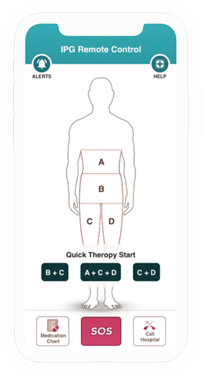
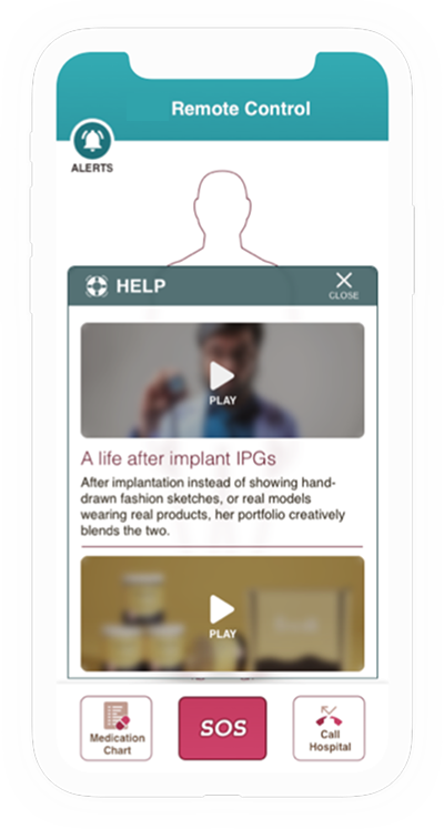
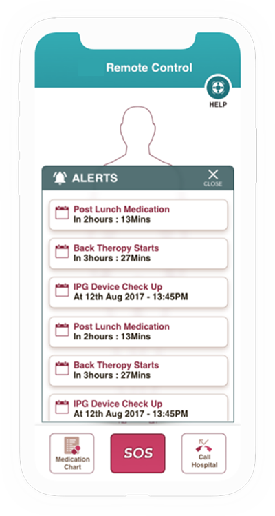
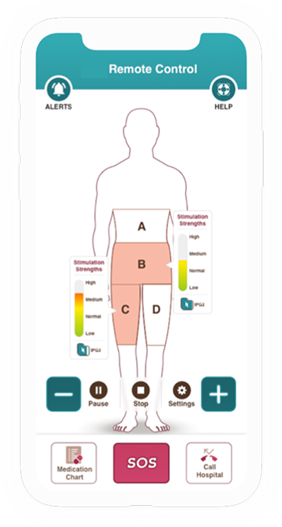
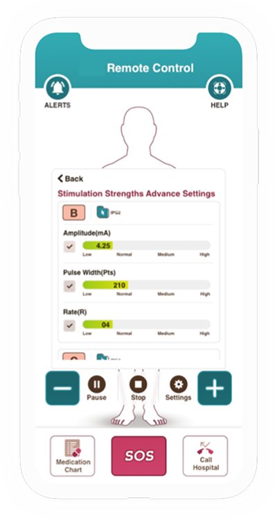
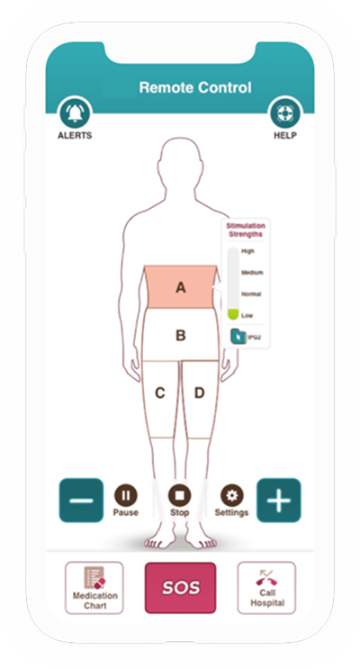
Original remote control mockup — screen 1
Original remote control mockup — screen 2
Original remote control mockup — screen 3
Original remote control mockup — screen 4
Original remote control mockup — screen 5
Original remote control mockup — screen 6
1 / 6
research& findings

research & findings

my role as lead ux architect

sole ux/ui architect for this reimagining exercise - reframed the original brief from "remote control" to a guided therapy companion, ran a heuristic gap analysis against the 2017 design, defined the accessibility strategy end-to-end, scoped two ai-assisted capabilities against a strict human-control standard, and designed the full patient and caregiver experience.

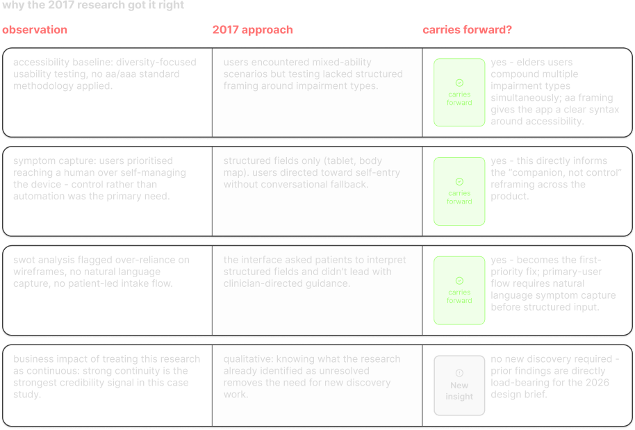
Why the 2017 research got it right — a table of observation, 2017 approach, and whether each finding carries forward

research & findings

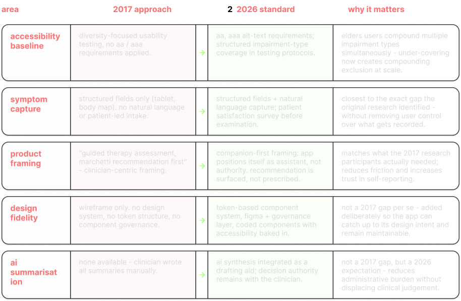
gap analysis: 2017 approach vs 2026 standard

what changed, what was missing, and why each gap matters for delivery.

Gap analysis table — area, 2017 approach, 2026 standard, and why it matters, across accessibility baseline, symptom capture, product framing, design fidelity and AI summarisation

reframing rationale: control → companion

the 2017 brief called it a remote control because that's what an ipg is - a device with adjustable settings. but the 2017 research itself never found patients treating it that way; the single most-used feature was reaching a clinician, not adjusting therapy. this reimagining takes that finding at face value: the product's primary job is reassurance and fast human contact, with bounded therapy adjustment as a secondary, safety-gated capability - not the headline feature the original name implies.

research & findings

who this app is designed for

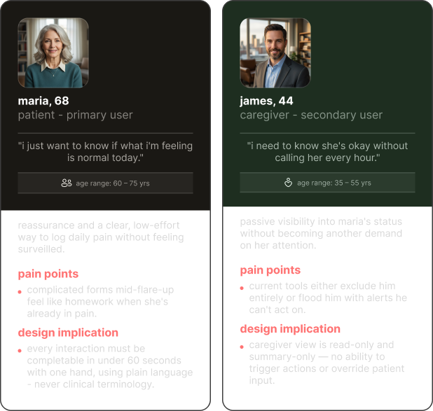
two distinct users with fundamentally different relationships to the same data - each requiring a tailored but unified experience.

User personas — maria, 68, primary patient user, and james, 44, secondary caregiver user, each with pain points and design implications
ideation& designthinking

ideation & design thinking

reframing the brief

the 2017 brief named this a remote control. the research from that same project told a different story - the single most-used feature in usability testing wasn't therapy adjustment, it was reaching a clinician. nine years later, that finding becomes the design brief itself: this is a guided therapy companion, not a control panel. adjustment stays, bounded within clinician-set limits; reassurance and fast human contact become the primary job.

Task and screen map — core patient journey (onboarding, home/today, log or adjust, guidance received) with a separate read-only caregiver view

jobs to be done

"when i'm managing chronic pain day to day, i want quiet confirmation that my therapy is working, so i don't have to interrogate a device to feel secure."

"when my pain changes, i want to record it without translating a lived, inconsistent sensation into a form that doesn't fit it."

"when something's genuinely wrong, i want my clinician to tell me what to do — not a device deciding that for itself."
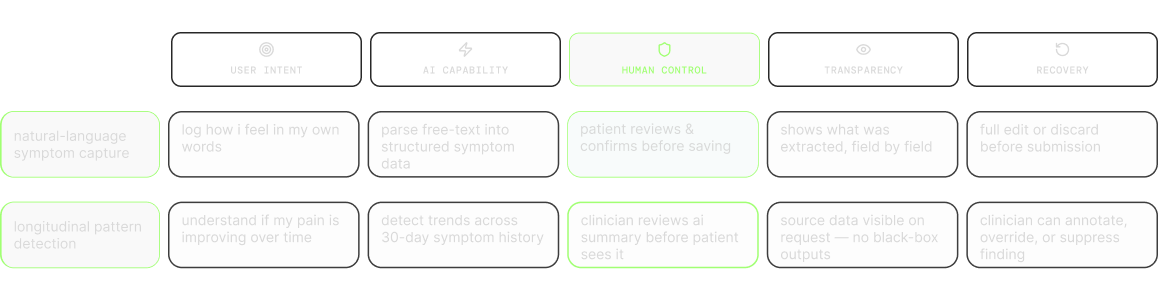
ai touchpoint

where ai earns its place - two capabilities, not a feature list. natural-language symptom capture exists because the original research already identified the actual failure mode

patients weren't struggling to use the device, they were struggling to translate an inconsistent sensation into structured fields, and that's precisely where adherence drops. longitudinal pattern detection exists because it's the one thing a static trend chart genuinely can't do

surface a correlation across weeks of noisy, multivariate data that a human wouldn't reliably spot by scanning a graph. both stay bounded by the same rule: the ai observes, the clinician decides. neither capability adjusts therapy, triggers an alert, or notifies anyone on its own.

AI touchpoint framework — user intent, AI capability, human control, transparency and recovery across natural-language symptom capture and longitudinal pattern detection

accessibility & inclusive design

1 / 7

ideation & design thinking

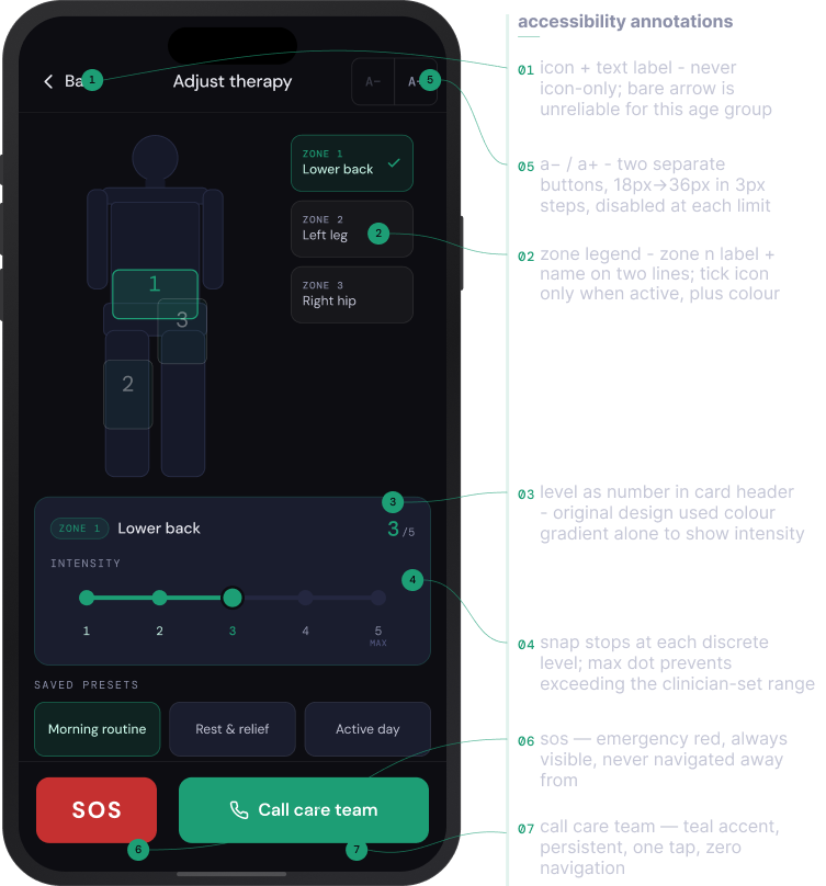
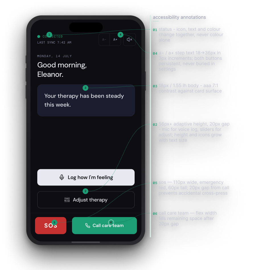
Reimagined adjust-therapy screen with accessibility annotations
Reimagined therapy screen
1 / 2
challenge& achievements

challenge & achievements

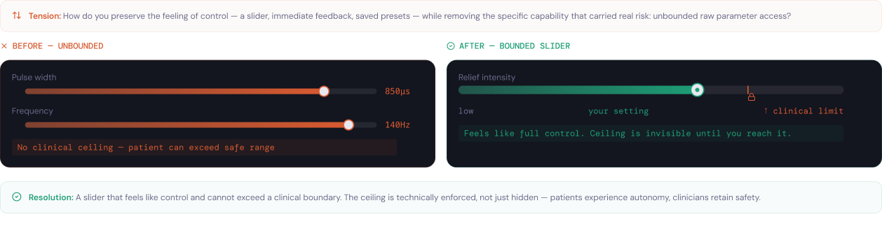
patient autonomy vs. clinical safety

the 2017 device exposed raw therapy parameters directly to patients. removing that access is clinically correct — but strip the sense of control away entirely and the product fails a different way. the design problem: preserve the feeling of control while removing the specific capability that carried real risk.

Before and after — an unbounded raw-parameter slider replaced by a bounded slider that feels like full control but cannot exceed a clinician-set ceiling

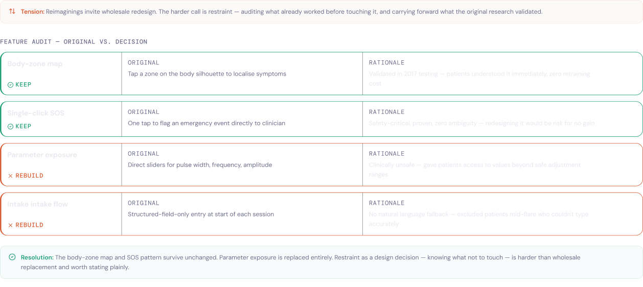
deciding what to keep vs. what to rebuild

a reimagining tempts you to redesign everything. the harder discipline is restraint — auditing what the original research already validated and carrying it forward untouched, so redesign effort lands only where it changes an outcome.

Feature audit — body-zone map and single-click SOS kept unchanged, parameter exposure and intake flow rebuilt, each decision paired with a rationale

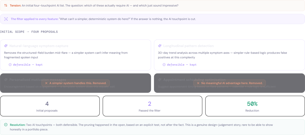
resisting ai-by-default

every proposed feature was run through a single test — "what can't a simpler, deterministic system do here?" if the answer was nothing, the ai touchpoint was cut. four proposals went in; two survived — a 50% reduction, decided in the open rather than justified after the fact.

Four AI proposals filtered — natural-language symptom capture and longitudinal pattern detection kept, personalised motivation messages and appointment scheduling removed as a simpler system could handle them

designing accessibility without primary research access

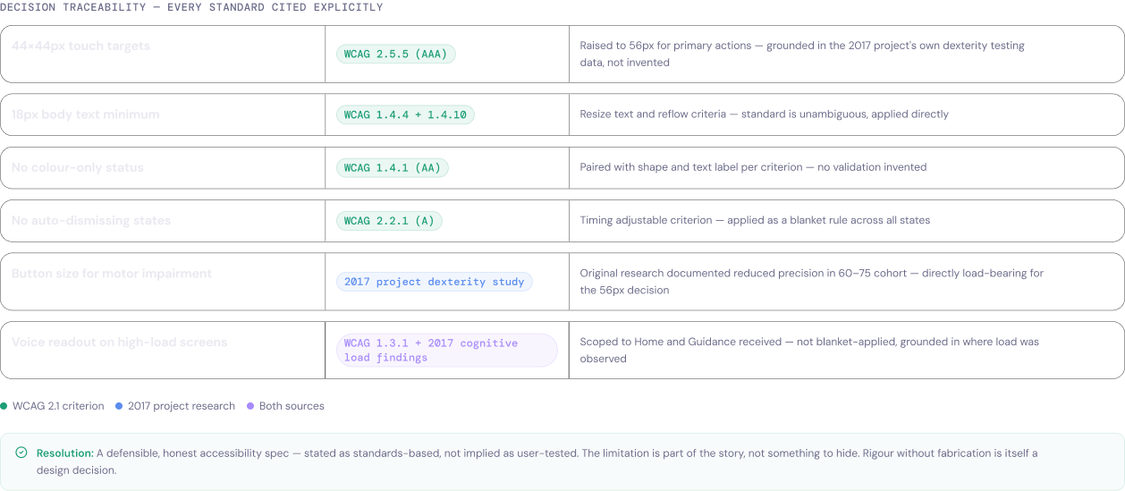
no new user testing was available for this reimagining. every accessibility decision is therefore traced to an explicit source — a wcag 2.1 criterion or the original 2017 project's own research — and stated as standards-based, never implied as freshly user-tested. rigour without fabrication is itself a design decision.

Decision traceability table — each accessibility choice cited to a specific WCAG 2.1 criterion or the 2017 project's own dexterity and cognitive-load findings
overview& takeaway

overview & take away

anticipated impact

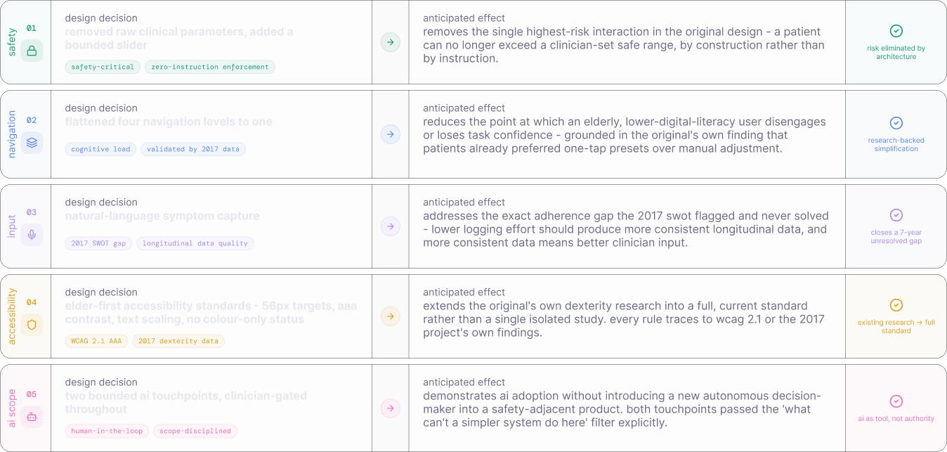
no usability data exists for this reimagining — it's speculative, not shipped, and claiming measured outcomes here would contradict the standard set earlier in this case study of never presenting invented research as real.

what can be stated honestly is what each design decision was built to produce, and why:

Anticipated-impact table — five design decisions (removed raw clinical parameters and added a bounded slider, flattened four navigation levels to one, natural-language symptom capture, elder-first accessibility standards, two clinician-gated AI touchpoints) each paired with its anticipated effect and a rationale tag

overview & take away

Six-panel storyboard — the starting point (a remote control), the realization (the device worked, the trust didn't), the users, the diagnosis (a standards-based audit, no live patients), the solution (bounded control, elder-first accessibility, clinician-gated AI), and the outcome: bounded by design — removed capability, not added feature

overview & take away

what this project taught me

this reimagining set out to answer a narrower question than

"how would this look today"

- it asked what the 2017 research already knew and never got to build. the single-click sos pattern, the body-zone map, the finding that patients preferred reaching a clinician over adjusting a device themselves: all of it was already there. the work here was mostly subtraction - removing the raw parameters, removing three navigation levels, removing two of four proposed ai features - in service of the one thing the original data was quietly pointing at the whole time: a device this personal needed to feel less like equipment and more like it was on the patient's side.

i learned to:

the strongest accessibility decision in this project wasn't something i added. it was the amplitude slider i took away. restraint reads quieter than a new feature, but for a population managing chronic pain through an implanted device, quieter is the whole point.