heuristic evaluation
benchmarked against nielsen's 10 usability heuristics. identified violations across status visibility, error prevention, and flexibility of use - with particular severity on recognition vs recall and system feedback.
i led the end-to-end ux evaluation, diagnosis, and redesign direction for this project. my engagement began before the application went live - which was both a challenge and an opportunity. there was no user feedback data. no support call logs. no usage analytics. what i had was the system itself, a set of target user groups, and over two decades of enterprise ux pattern recognition.
with no live usage data available, i treated the application as the primary research subject. expert evaluation, heuristic analysis, workflow walkthroughs, and an ergonomic field observation gave me the evidence base to diagnose both the visible friction and the systemic patterns beneath it.
"every mature application reaches a point where the interface needs to catch up with what the system can do."
benchmarked against nielsen's 10 usability heuristics. identified violations across status visibility, error prevention, and flexibility of use - with particular severity on recognition vs recall and system feedback.
discovered desk-based user groups (super admins, admin managers) routinely work across 37-inch wide-screen monitors and 14-inch laptops simultaneously. this informed layout density and information hierarchy for desktop views.
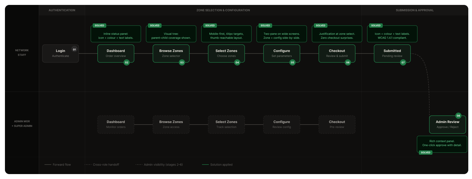
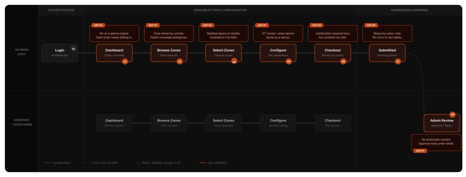
mapped the five-stage approval workflow end-to-end. performed cognitive walkthroughs for each user group across zone selection, checkout, and order management scenarios.
evaluation severity scored across primary interaction zones, weighted by user group impact and frequency of encounter.
three distinct user groups with fundamentally different device contexts - each requiring a tailored but unified experience.
"owns the system. needs the full picture at all times."
37" wide-screen + 14" laptopmanages platform-wide access policies, user roles, and system configuration. works at a fixed desk with a dual-screen setup. responsible for large data sets and high-volume oversight.
"processes the queue. speed and clarity are everything."
37" wide-screen + 14" laptopreviews and approves access requests. manages multiple orders simultaneously. desktop-primary but may review on-the-go. needs one-click actions and clear status visibility to maintain throughput.
"in the field. one hand. needs it to just work."
handheld + tablet & mobilefield engineers requesting zone access at building entrances, equipment rooms, and restricted areas. primarily mobile users. needs fast, thumb-reachable interactions with minimal scrolling.
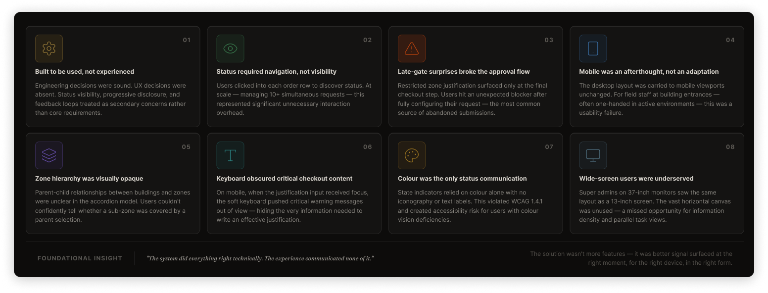
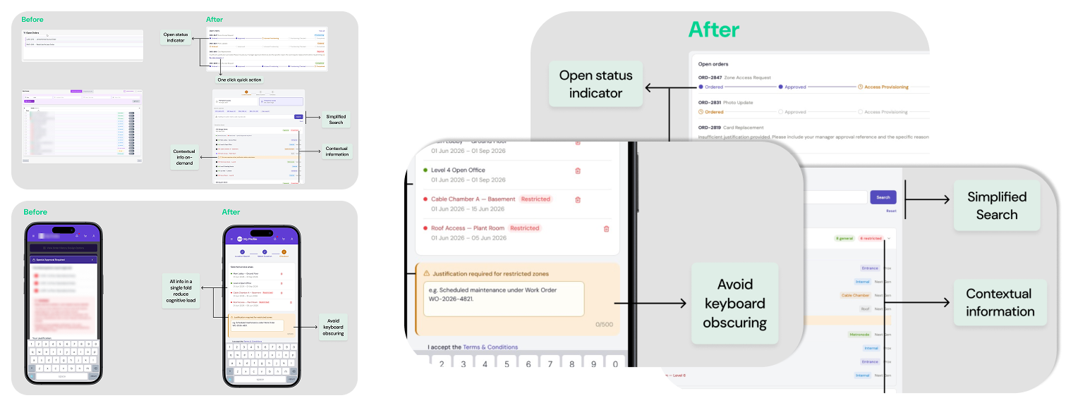
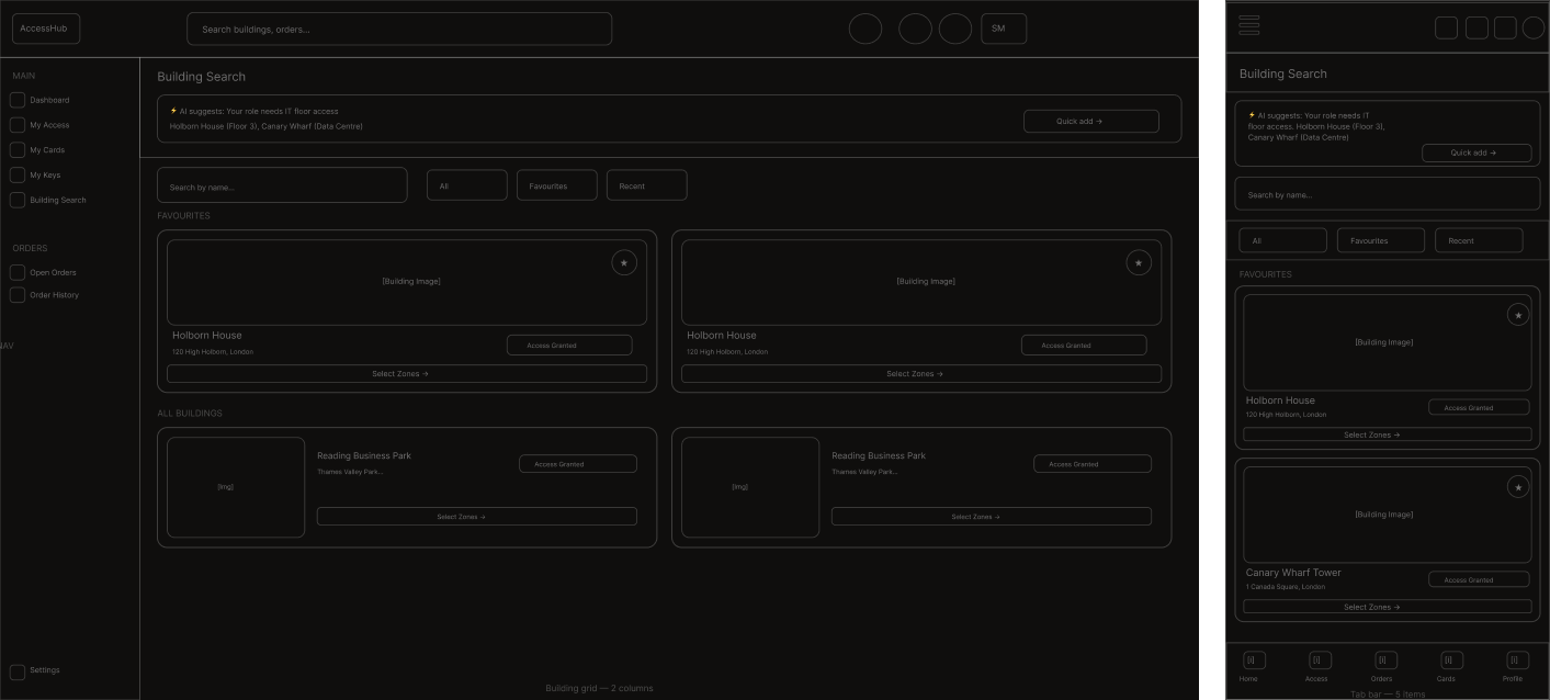
six recurring failure patterns - each with a direct design solution. two layout proposals below.
users must open each order row individually to check status. at scale - managing 10+ simultaneous requests - this creates significant unnecessary interaction overhead.
restricted zone justification only appears at final checkout. users complete the full flow before hitting this blocker - most common cause of abandoned submissions.
desktop layout carried to mobile viewports unchanged. small touch targets and horizontal scroll - particularly problematic for field staff at building entrances.
zone relationships between buildings and constituent zones are unclear. users can't determine whether a sub-zone is covered by a parent selection. ambiguity drives errors.
justification input focus triggers the soft keyboard, pushing critical warning messages out of view - hiding the information needed to write an effective justification.
state indicators use colour exclusively with no iconography or text labels. violates wcag 1.4.1. creates barriers for users with colour-vision deficiency.
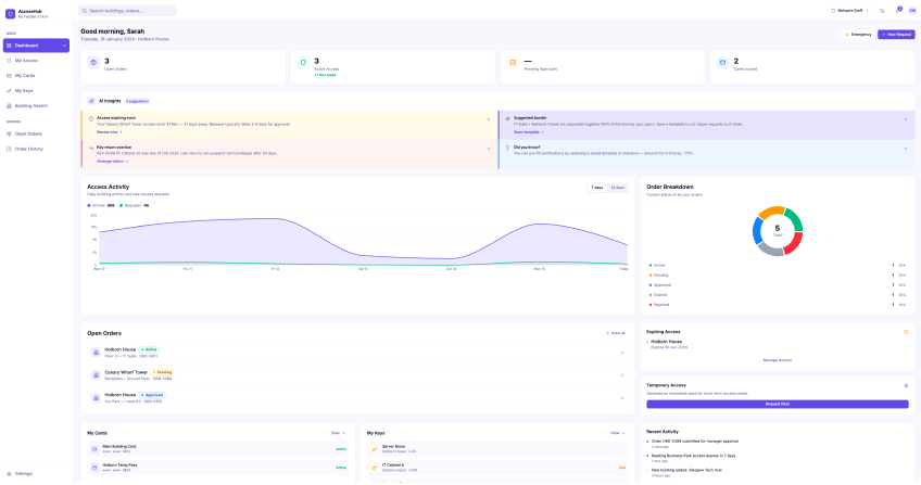
colour-coded state, progress tracker and approval summary so users can scan all active orders at a glance without navigating into each row.
justification requirements surfaced within the zone selection accordion when a restricted zone is selected. zero late-gate blockers at checkout.
thumb-zone optimised layout, 44px minimum touch targets, bottom navigation pattern, keyboard-scroll-aware behaviour. tablet intermediate breakpoint defined.
indented zone tree with visual inclusion indicators. parent selection states show coverage. sub-zone coverage determinable without guessing.
css scroll behaviour anchors the justification input within a fixed viewport zone. critical warning content remains visible above the keyboard at all times.
status communicated via colour + icon + text label in combination. wcag 1.4.1 compliant. screen reader accessible. universally interpretable.
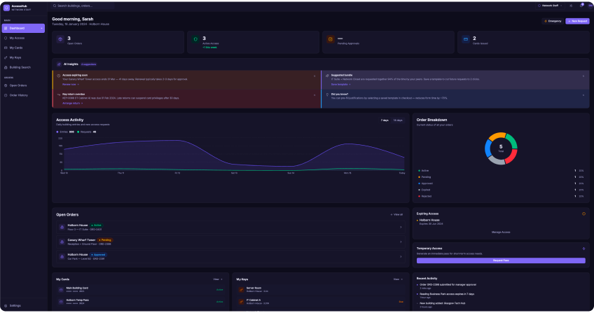
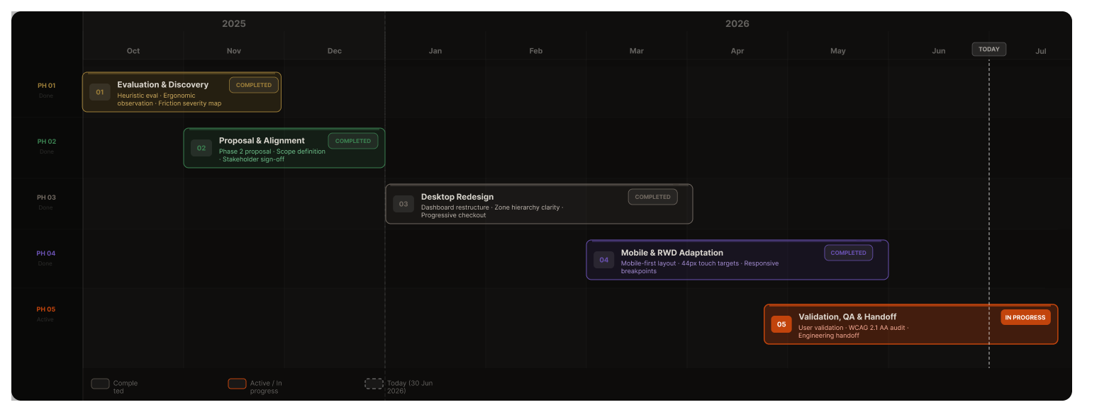
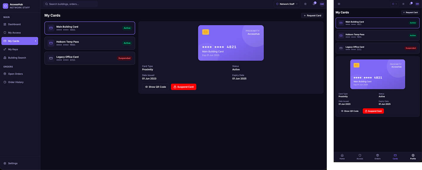
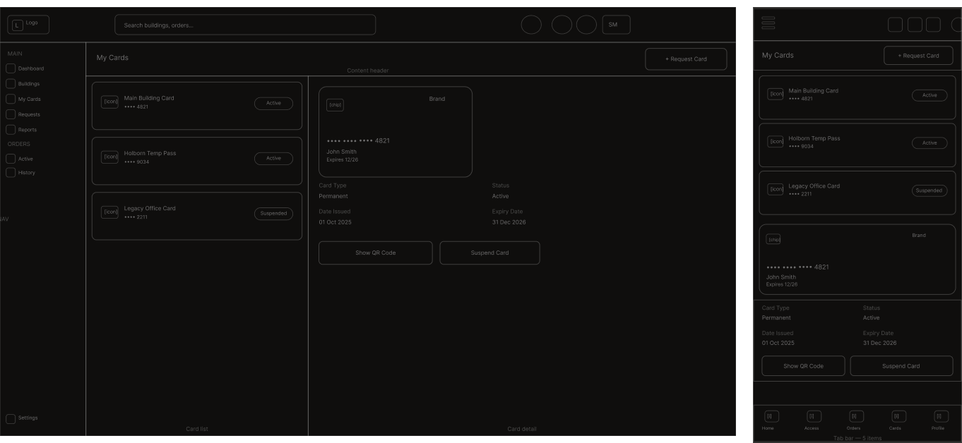
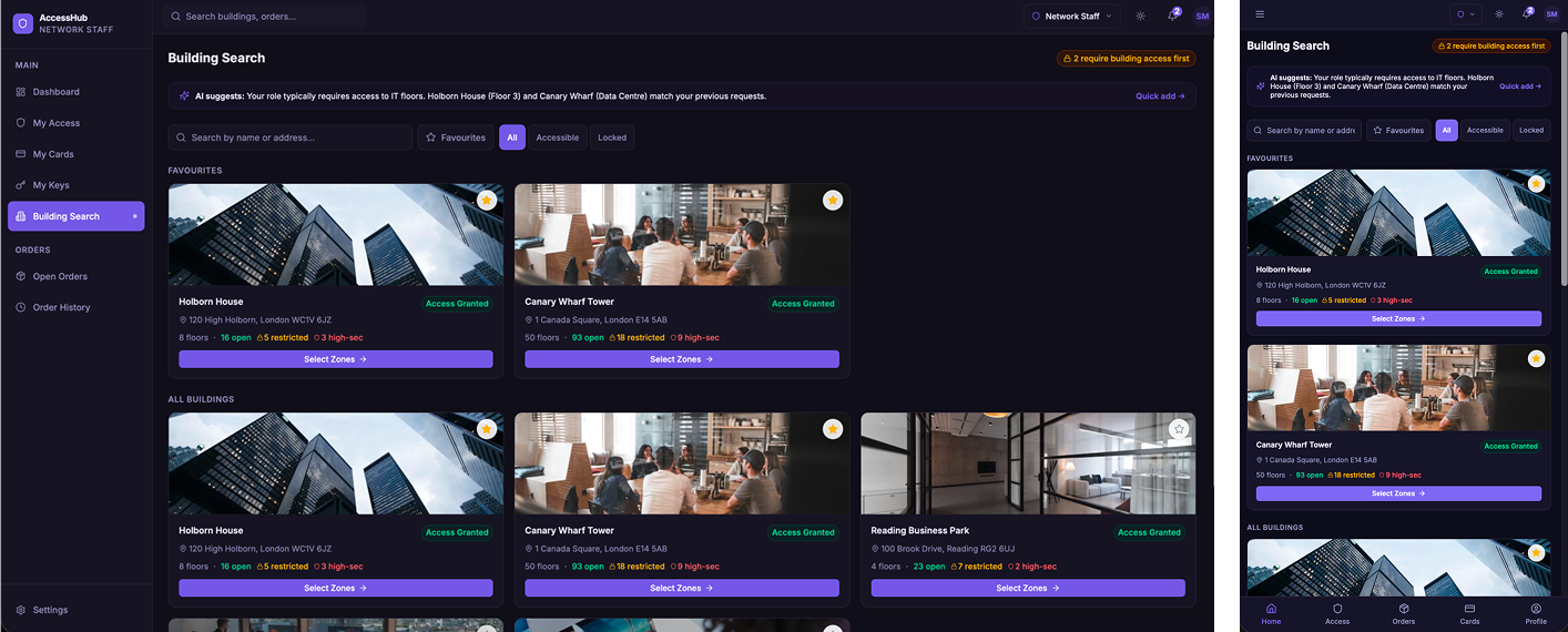
every screen improvement was achieved within the constraint of the existing codebase. html restructuring and css adaptation - no backend changes, no parallel application. the visual outcomes below represent the key workflow screens across desktop and mobile.
these outcomes are based on internal evaluation sessions and usability validation with representative users prior to engineering handoff. the application was not live to primary users during the engagement - outcomes reflect pre-evaluation findings and projected improvements.
working on a system before it reaches users is a rare position to be in. the feedback loops that normally shape iteration don't exist yet. what you have instead is pattern recognition, structured evaluation methodology, and the discipline to design for users who aren't in the room - and who will encounter every friction point you missed, at scale, on day one.
designing for a system before it meets its users is not a limitation - it is a responsibility. every friction point you catch in evaluation is one a field engineer won't face at a building entrance at 7am. the aha moment wasn't finding the problems. it was realising no one else had looked for them.
one codebase, zero backend changes, three user groups, and two screen extremes - from 37-inch wide monitors to field handhelds. the constraint wasn't the obstacle. it defined the problem precisely. that is where ux architecture earns its place.