bridging design and code. application - global design system.

client computershare
industry financial services
duration 2024 - 2026

my role design system lead

tools figma, miro, token studio, supa pallet, zeroheight, storybook
methods accessibility & color - audit & research, interface pattern workshops, agile sprints, ci/cd, token feasibility checks
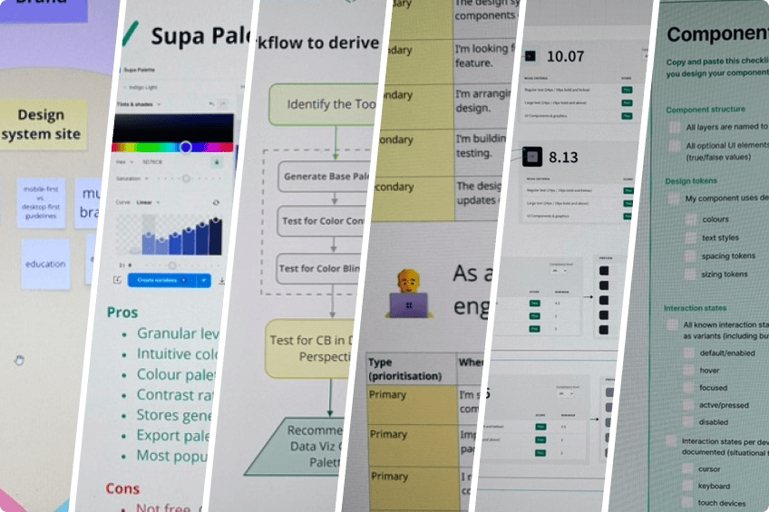
Global design system process collage — supa palette generator, workflow to derive design decisions, and component checklist

project overview

product teams faced delays due to repeated design decisions and inefficient handoffs. design-to-code gaps caused inconsistencies between intended and implemented ui. teams moved fast - but in different directions - creating inconsistency and confusion.

without a unified system, both user experience and delivery efficiency began to decline.

"scaling design isn't about components-it's about aligning people, process, and platforms."

led the creation of a scalable, consistent, accessible, and operationalised an enterprise design system integrating figma tokens, storybook, and ci/cd pipelines-streamlining design-to-development workflows and reducing implementation friction.

research& findings

research & findings

key challenges

  • fragmented ui patterns across products created inconsistent user experiences and reduced user trust
  • multiple teams independently built similar components, leading to duplication and increased maintenance effort
  • lack of a single source of truth resulted in misalignment between design, development, and product teams
  • accessibility standards were inconsistently applied, exposing compliance risks (wcag 2.1 gaps)
  • design-to-development handoff relied heavily on static specs, causing interpretation errors in implementation
  • no clear governance model for component lifecycle, leading to uncontrolled design drift
  • onboarding new designers and developers was time-consuming due to poor documentation and lack of system clarity
  • data visualisation components (charts, dashboards) failed contrast and usability standards
  • cross-team collaboration was siloed, especially across time zones in agile delivery setups

research approach

  • conducted cross-product ui audit to identify duplicate components and inconsistency patterns
  • facilitated stakeholder interviews with product owners, designers, and front-end engineers to uncover workflow friction
  • performed accessibility audits using wcag 2.1 aa/aaa guidelines, focusing on contrast, states, and interaction patterns
  • ran design critique workshops across squads to align on pain points and expectations
  • collaborated with developers to analyse codebase component reuse vs. rebuild frequency
  • mapped design-to-code workflow journey to identify breakdowns in handoff and implementation
  • evaluated existing design assets in figma to assess token readiness and scalability potential
  • benchmarked against industry design systems (material, carbon) to identify maturity gaps

this research revealed a pattern

  • identified over 50-60% component duplication, validating the need for a centralised system
  • established the need for a token-driven architecture to bridge design and code
  • recognised accessibility must be embedded at the foundation level, not retrofitted
  • defined the requirement for a governance model (contribution, approval, lifecycle tracking)
  • highlighted the importance of developer-first thinking to improve adoption and trust
  • validated that teams needed clear usage guidelines, not just component libraries
  • confirmed that documentation (zeroheight) would be critical for scalability and onboarding
  • identified opportunities to standardise data visualisation patterns for clarity and compliance
  • established design system success metrics: adoption, reuse rate, and delivery speed improvement
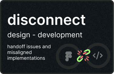
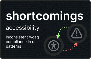
60% duplicate components across products, leading to inefficiencies Disconnect between design and development — handoff issues and misaligned implementations Shortcomings in accessibility — inconsistent wcag compliance in ui patterns

inconsistent ui patterns

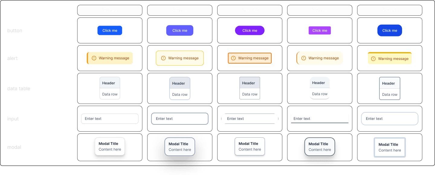
component inconsistencies across product squads

each squad designed and built their own version of core ui elements - buttons, modals, tables without reference to other squads. colour, spacing, and typography values were hardcoded in isolation. the same action looked and felt different depending on which screen you were on.

Component inconsistency matrix — five squads each with divergent button, alert, data table, input and modal styles

wcag compliance audit

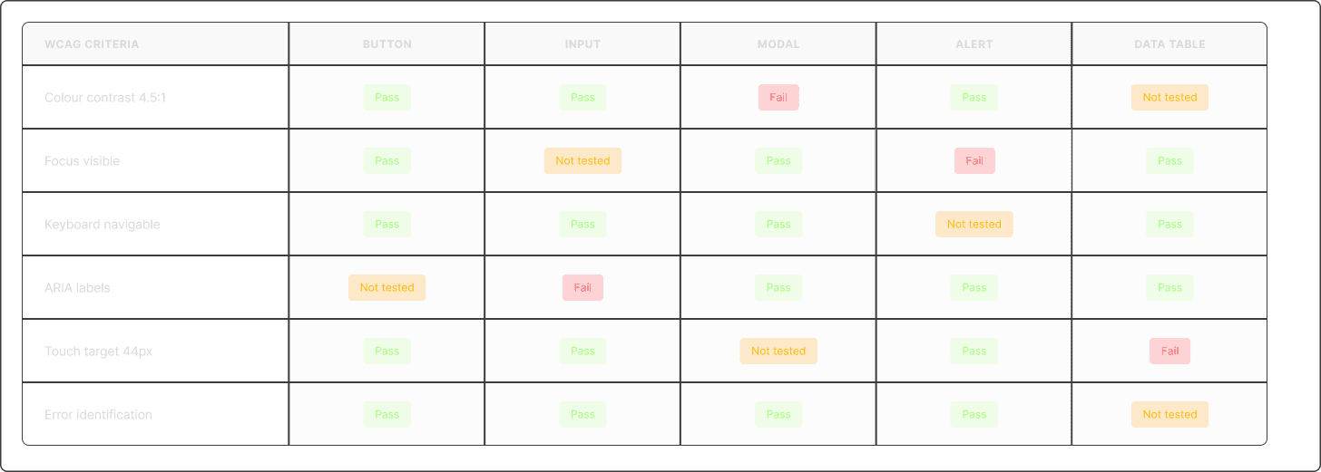
component accessibility assessment against wcag 2.1 level aa criteria

colour contrast, focus states, and touch targets weren't validated at component level. wcag compliance was checked occasionally never systematically. keyboard navigation, aria labels, and screen reader behaviour weren't part of the design or acceptance criteria.

Accessibility audit table scoring components against WCAG 2.1 AA criteria with pass, fail and not-tested states

weak design to code alignment

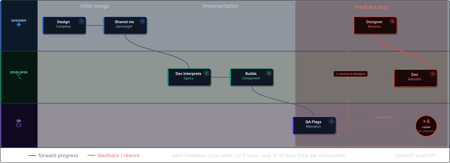
current handoff: 4 back-and-forth cycles per component

designers handed off screens without annotation, token references, or interaction specs. developers interpreted intent and filled the gaps with their best guess. developers stopped trusting figma as a source of truth. designers felt their work was being ignored. the relationship broke down before the sprint even ended.

Design-to-code handoff flow showing a seven-step loop repeating four times, adding 8–12 days per component

governance challenges

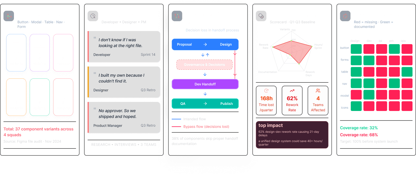
when documentation and approval workflows aren't aligned, product teams pay the price - in time lost, decisions duplicated, and trust eroded.

Documentation fragmentation and no approval workflow — outdated files, tribal knowledge, unclear approvals Governance evidence — divergence gallery, persona pain quotes, component lifecycle map, cost of inconsistency and doc coverage heatmap
ideation& design thinking

ideation & design thinking

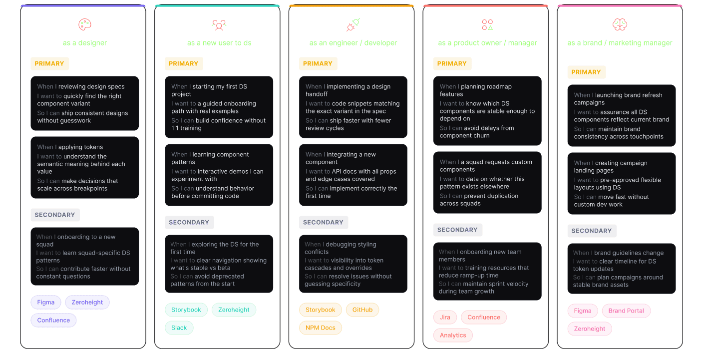
Jobs-to-be-done persona cards — designer, new DS user, engineer, product owner and brand manager with primary and secondary jobs

adoption strategy

a phased approach to rolling out and integrating the design system across product teams and workflows.

Adoption strategies — incremental adoption, DS dependency adoption and brand refresh entry, each with pros and cons

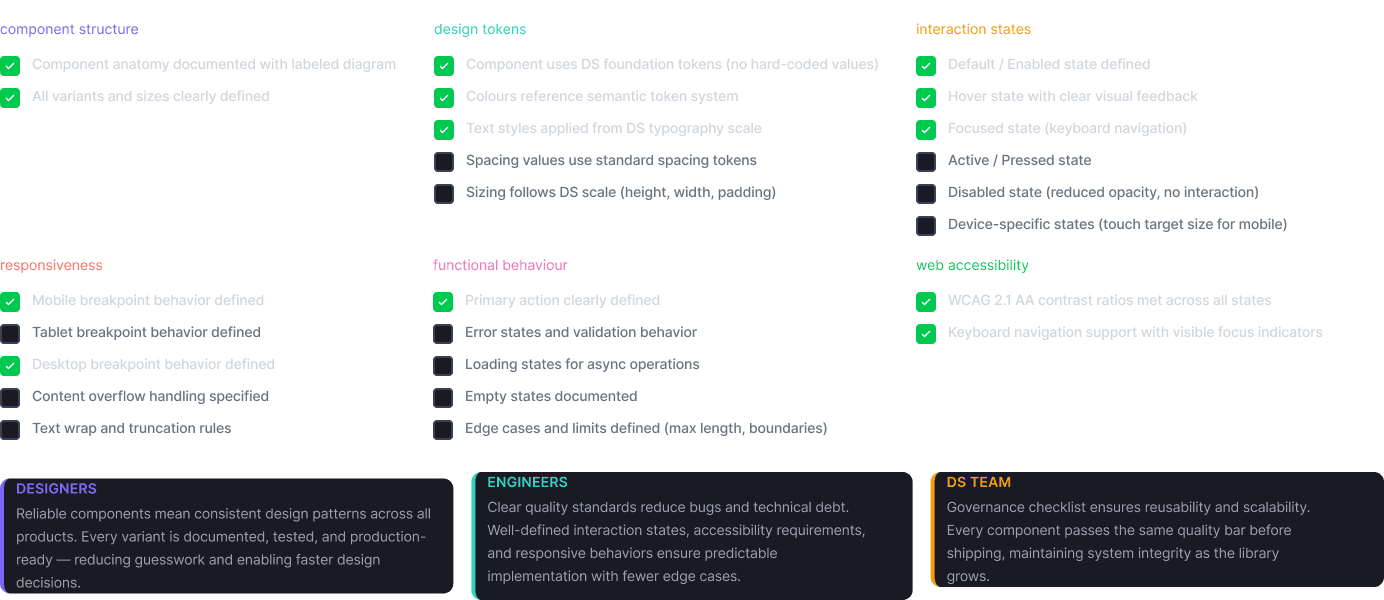
component checklist

quality criteria applied to all design system components

Component quality checklist — structure, design tokens, interaction states and accessibility criteria for every component

atomic design system approach

global enterprise design system - 6-level hierarchy across 4 platforms

Atomic design system — adoption depth by atomic level, compel/persuade/mandate strategy, and tokenisation, accessibility and platform agnosticism pillars
challenge&achievements

challenge & achievements

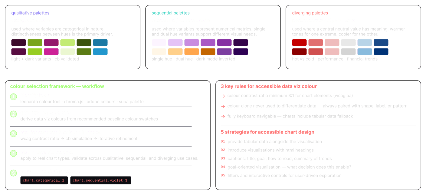
a rigorous, iterative framework for accessible chart colours

financial dashboards demand colour that is accurate, accessible, and beautiful - validated at every step.

Colour foundation research — qualitative, sequential and diverging palettes, a five-step selection workflow, and accessible data-viz colour rules

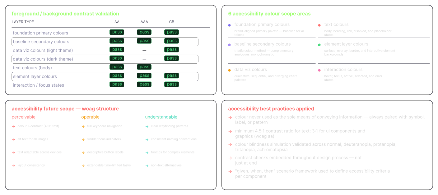
wcag aa/aaa - systematically validated across all colour layers

accessibility as a primary design constraint from token creation - not a final gate.

WCAG AA/AAA validation — contrast pass table across colour layers, six accessibility colour scope areas, and best practices applied

gestalt foundations baked into the system

cognitive psychology principles encoded into every component decision

Gestalt foundations — figure/ground, proximity, common region, similarity and focal point encoded into component decisions

extending component flexibility without breaking the system

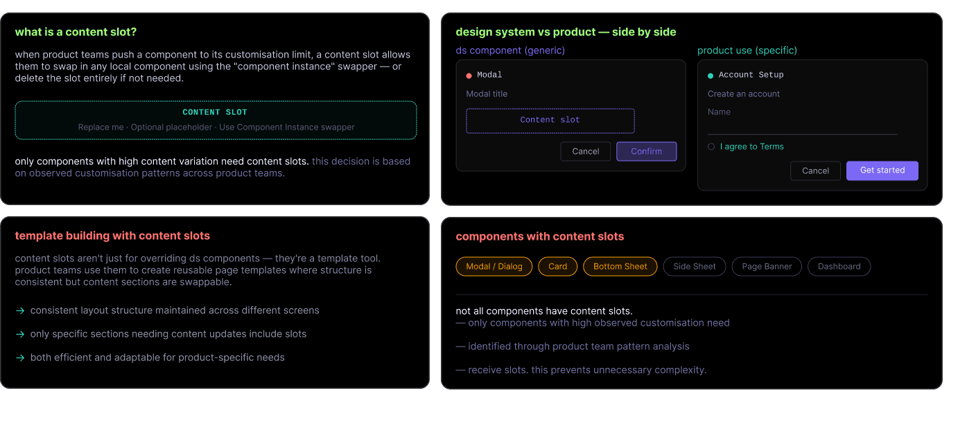
content slots solve the "i need more than the component gives me" tension - without forking the system.

Content slots — what a slot is, design-system vs product side-by-side, template building, and which components receive slots

challenge & achievements

a rigorous, iterative framework for accessible chart colours

governance is what turns a component library into a design system. we built a three-layer quality model: component design checklist, visual testing workflow, and release governance cycle - each serving a different audience.

Three-layer quality model — component design checklist, how-we-work DS team loop, why quality assurance matters, and the component inventory categories

challenge & achievements

token-to-code pipeline - a fully automated design-to-delivery system

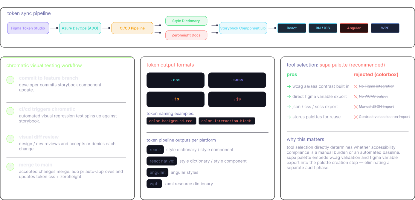
the most technically complex contribution: designing and co-architecting an end-to-end token synchronisation pipeline spanning figma token studio → azure devops → style dictionary → storybook → zeroheight - with ci/cd at the core.

Token sync pipeline — Figma Token Studio to Azure DevOps to CI/CD to Style Dictionary and Zeroheight, output to React, RN/iOS, Angular and WPF, with chromatic visual testing and token output formats
overview& take away

impact & kpis

measurable outcomes across adoption, performance, and design quality

over 24 months - zero infrastructure to a fully governed, adopted, multi-platform system across 3 dimensions.

Impact KPIs — 80+ components, 240+ tokens, 100% WCAG AA, 40% handoff reduction, 4 teams, 4 platforms; adoption, delivery and accessibility metrics; qualitative outcomes and artefacts produced

overview & take away

Overview comic — the starting point, research & empathy, the build-team pipeline (Figma meets code), WCAG AA/AAA colour system, governance & adoption, and outcome & impact

overview & take away

building systems that outlive the project

this project taught me how to lead a ground-up enterprise design system across global product teams - turning fragmented, inaccessible ui into a governed, automated, multi-platform system.

i learned to:
  • define a design system's scope before writing a single component
  • turn accessibility from a final gate into a primary design constraint
  • translate token architecture into something engineers want to build on
  • govern across four product teams without losing their autonomy
  • apply jobs-to-be-done research to internal tools, not just end products
  • make ci/cd and design pipelines work together, not in parallel
building a design system for a global enterprise is not a design problem. it is a systems problem - where brand, code, governance, and human behaviour all have to reach the same conclusion at the same time. this project taught me that the hardest part is never the component. it is the shared understanding of what the component is for, who owns it, and what happens when it breaks.
it remains one of the most technically and strategically demanding engagements of my career - where 21 years of ux experience, deep accessibility knowledge, and cross-functional leadership had to converge into a single, living system that four global teams could trust, contribute to, and build on.