transforming crm. deal express.

client global bank (anonymised)
industry financial services
duration 2018 to 2024

my role lead ux architect

tools figma, html/css, miro, a low-code banking platform
methods heuristic evaluation, contextual inquiry, design thinking workshops, agile sprints, design system integration

in 90 seconds

context

deal express is a global bank's crm for selling. sales teams and product owners use it to move a prospect from first conversation to signed deal, across offices from london to chennai.

problem

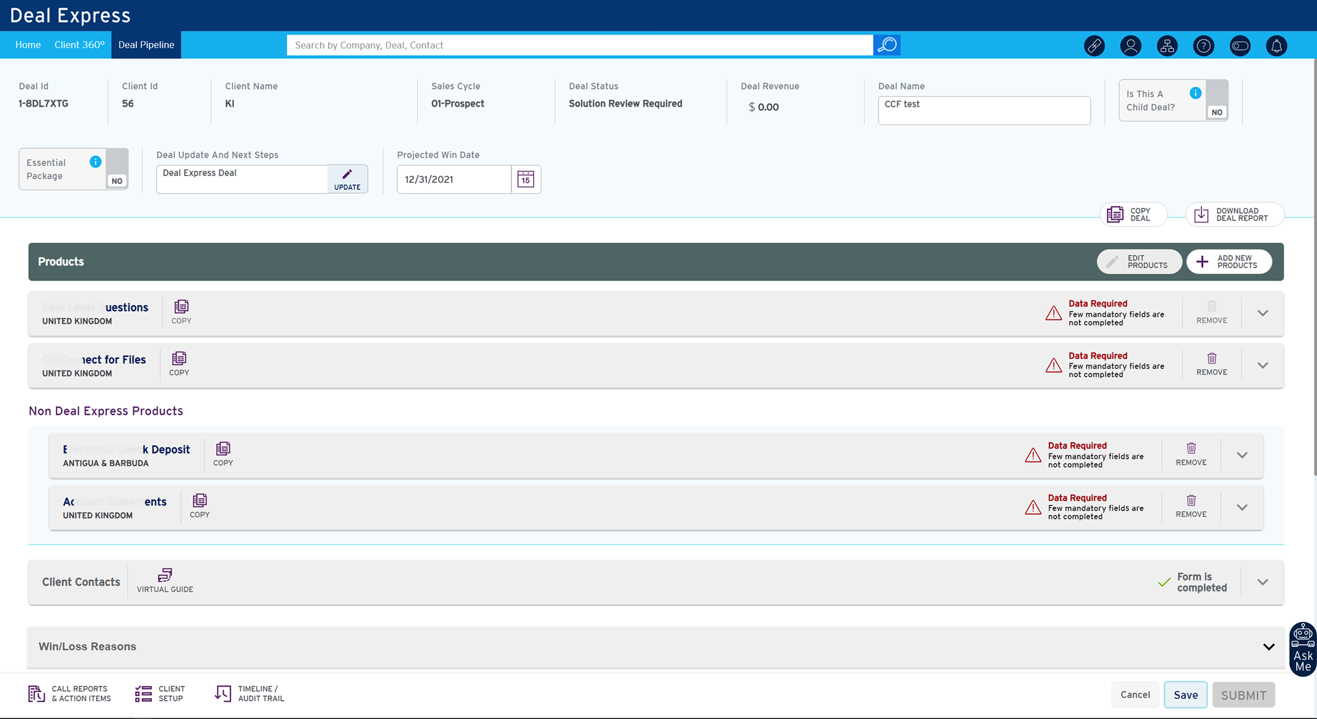
using it was hard work. a simple deal update meant hopping between screens, and each product's form asked 246 questions, much of it information the bank already held. people made mistakes, support tickets piled up, and every new product took two weeks of front-end work.

my mandate

lead ux architect, 2018 to 2024. i owned the ux end to end: research, redesigning the workflow, the design-system foundations and the handover to code. i led and mentored three designers on the account and partnered with four engineering squads, working daily with sales users, approvers and product owners.

three key decisions

  1. ask less, remember more. deal capture was rebuilt around what the bank already knew, so the form dropped from 246 questions to 168 and fills in what it can.
    see the workshops and flow maps →
  2. fix the foundations first. colour, type, spacing and interaction tokens were mapped straight to code, so every screen speaks one language and accessibility comes built in.
    see the design foundations →
  3. let teams assemble, not rebuild. reusable components with the basics already working, plus layout templates, so front-end teams put screens together from a kit.
    see the design-to-code pipeline →

outcome

questions per product: 246 → 168 (32% fewer). in testing after the redesign: 56% fewer usability issues, 68% fewer data-entry errors, 47% fewer support tickets. 40% of fields filled in automatically. a new product's front end: two weeks → four days. built to wcag 2.1 aa, checked by internal audit at component level.

measured in q4 2022 against the pre-redesign baseline, from the service-desk report and 8 usability sessions.

reflection

a global crm is an ecosystem, not a screen. getting five time zones to agree took as much design as the interface did. next time i'd put users in the room sooner; product owners had been speaking for them.

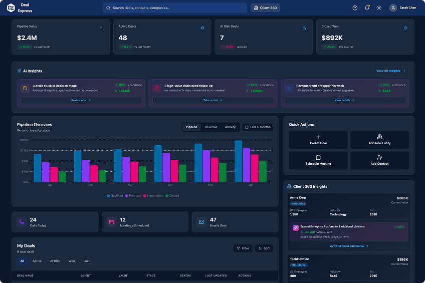
deal express dashboard, 2026 reimagining in the dark theme: pipeline value, ai insights, pipeline chart by stage and quick actions
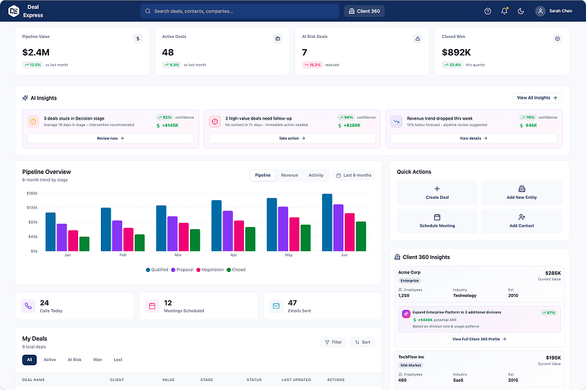
the same deal express dashboard in the light theme
reimagined 2026 · original structure and layout light dark

a 2026 reimagining of the deal dashboard, keeping only the original structure and layout. drag, or use the arrow keys,
to compare the dark and light themes. the ai insights panel is a 2026 addition, not part of the original delivery.

open the 2026 prototype

research & findings

the core finding: the system kept asking people for information it already had. the repetition and ambiguity users described were not screen-level usability issues; they were systemic communication problems between products, regions and teams.

research approach

  • 22 interviews across 4 regions and 4 user groups: sales teams, account managers, implementation managers and activity approvers
  • customer support as a secondary group, plus a group session with business and technology stakeholders
  • contextual inquiry with product and sales teams
  • heuristic evaluation of existing workflows
  • cognitive walkthroughs to find mental load and friction points
  • task analysis and journey mapping in miro
  • an ecosystem study: interviews with business stakeholders and regional product owners, mapping every contact point in a prospect's deal life cycle
  • a product-by-product review: over 200 products classified by user flow and complexity

baseline, by cognitive walkthrough across scenarios: creating a deal and submitting it took 10 minutes and 56 mouse clicks, counting adding a product to the deal, not configuring it.

heuristic evaluation

hover a heuristic to read its score for the screen on show

what users struggled with, across roles and regions

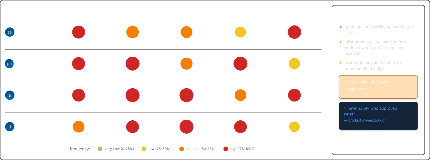
aggregated pain points from 4 regions, 4 user groups, and 22 interviews.

outcome: repetition and visibility gaps affected all four roles; collaboration pain peaked among product owners because of time-zone mismatch.

pain point heatmap across four user roles and five pain categories, with a key observations panel. the finding is in the caption below.

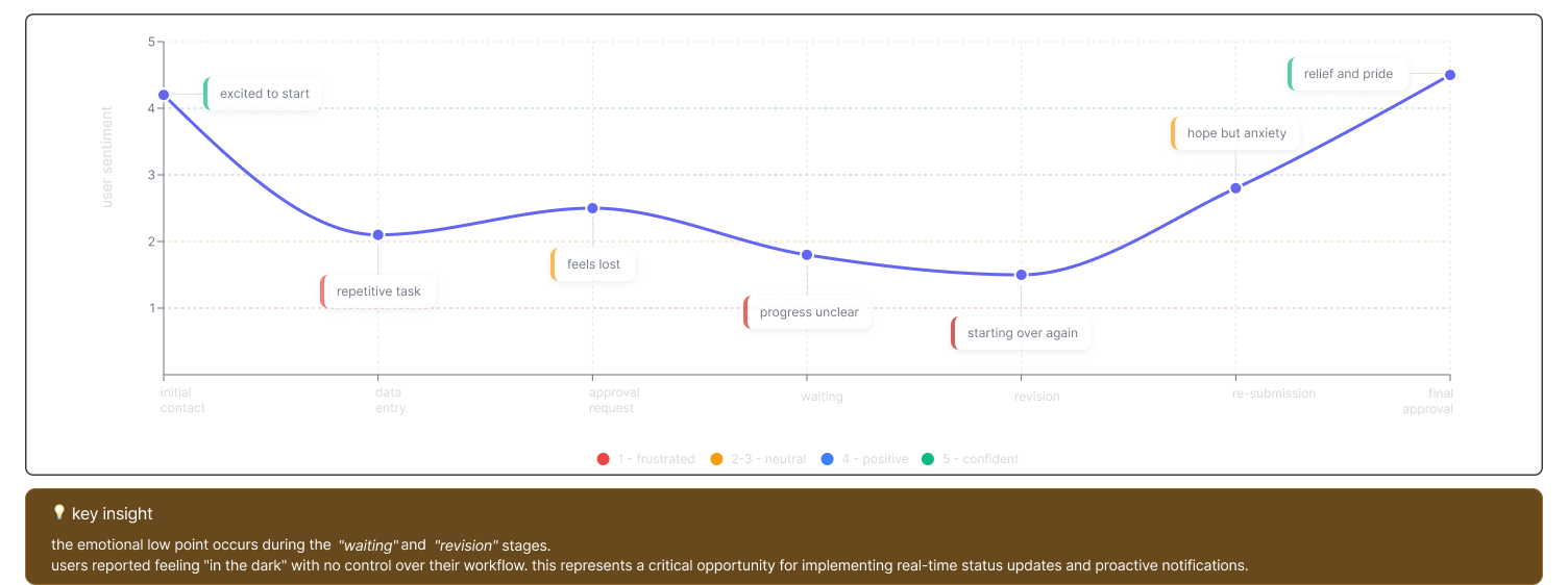
the emotional journey through deal approval

tracking user sentiment across key workflow stages, revealing pain points through emotional storytelling.

outcome: sentiment is lowest while users wait for approval and rework the deal.

emotion curve across the seven deal approval stages; sentiment is lowest while waiting for approval and revising. the finding is in the caption below.

research synthesis: theme clustering

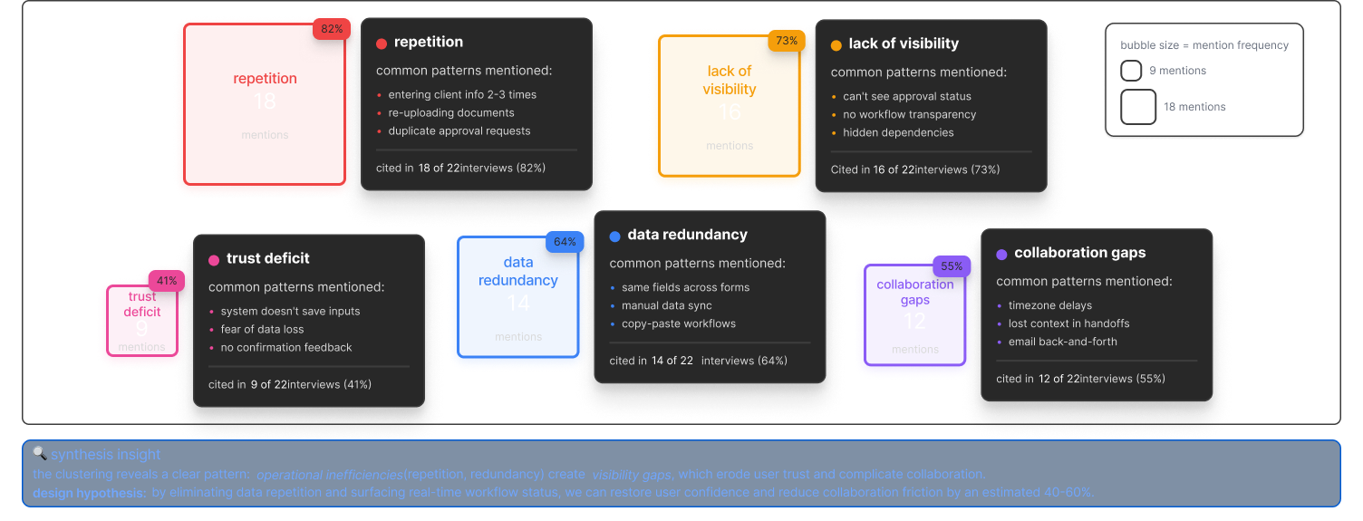
across 22 interviews, five dominant themes surfaced, forming the backbone of our design hypothesis.

outcome: five themes surfaced; the largest was repetition, cited in 18 of 22 interviews.

five research themes from 22 interviews, sized by how often each was mentioned. the finding is in the caption below.

cognitive load distribution: where users spend their effort

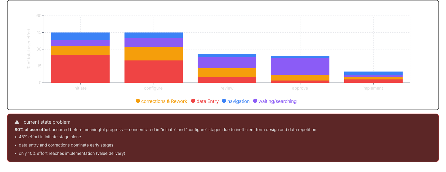
mapping user effort across workflow stages reveals front-loaded friction and opportunities for efficiency gains.

outcome: 80% of effort lands before meaningful progress, in initiate and configure; only 10% reaches implementation.

user effort by workflow stage, split by data entry, corrections, navigation and waiting. the finding is in the caption below.

charts recreated for this case study to protect client confidentiality; patterns reflect the original research.

research takeaways

the system asked for what it already knew

each product had added its own flow over years, so long, repetitive forms made people re-enter known client data. errors followed.

effort outweighed value

sales users spent more time feeding the system than selling, and confidence in the data dropped.

no one could see where a deal stood

without clear status, people chased approvals by email and phone, which drove support calls.

users were spoken for, not heard

product owners in separate time zones made decisions for users without them, and developers couldn't see the intent behind screens.

deal capture: before and after

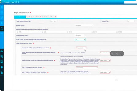
the original deal form: one long sequential page with deal header fields, a products list and client contacts stacked below each other, several rows flagged data required
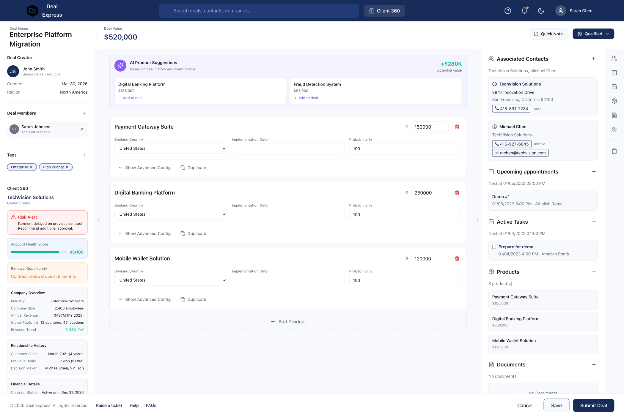
the reimagined deal form: products as cards in the centre, client context, risk alerts and account health in a side panel, and ai product suggestions at the top
before reimagined 2026

drag, or use the arrow keys, to compare. the reimagined form groups products into cards, moves client context into a side panel and prefills what the bank already holds, so people confirm rather than re-enter. reimagined in 2026, keeping only the original structure and layout.

key decisions & how i got there

research pointed to three decisions. each card shows what i chose, what it cost and what it changed.

1ask less, remember more

problem
246 questions per product, much of it data the bank already held.
how i worked
every product was classified by flow: 94 sequential, 13 dynamic and 170 simple. that also surfaced the three products essential to creating a deal. then question consolidation workshops with product owners in each region.
what i chose
rebuild deal capture around what the bank already knew, under three rules: removed if already held, merged if duplicated across products, deferred if not needed until a later stage.
what it cost
prefill was not a design decision alone. it depended on data analysts mining historical data-flow trends, and on data owners agreeing their records could be reused.
result
246 to 168 questions, 32% fewer, and 40% of fields prefilled.
2fix the foundations first

problem
the engineering teams were split by region and by vendor, each following its own code practice, so patterns drifted and accessibility was inconsistent.
what i chose
shared colour, type, spacing, elevation and interaction tokens mapped straight to production code, with accessible colour standards built in and the layout structure globalised.

what it cost
a slower first release, in exchange for faster and more consistent releases after it.
result
one visual language across the crm modules, with accessibility built into the components rather than checked at the end.

3let teams assemble, not rebuild

problem
each new product took two weeks of front-end work, delaying every release.
what i chose
reusable components with their states already working, layout templates, a component playground and a ci/cd pipeline, governed through bi-weekly design guilds.
what it cost
three months of my own time learning the vendor's standalone platform and integrating the design system into its core css library, plus ongoing guild time from every region.
result
a new product's front end in four days.

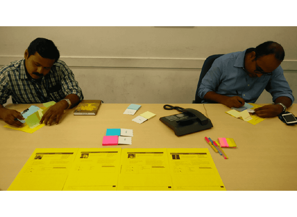
co-creation workshop

an empathy study with users and stakeholders in the same room, run alongside the cognitive walkthroughs, to find the gap between who the business thought the users were and who they actually are.

outcome: most stakeholders could not say who the users were, or what they wanted from the application.

co-creation workshop: two participants working through printed persona and worksheet templates at a table

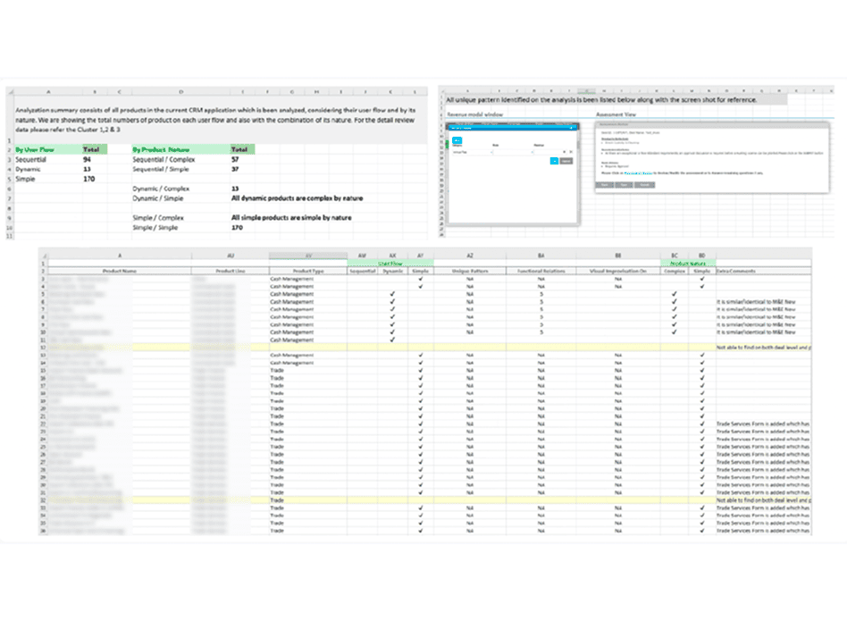
product analysis

every product in the crm classified by user flow and by nature: 94 sequential, 13 dynamic and 170 simple.

outcome: the complexity sat in a small group of products, and three turned out to be essential to creating a deal.

spreadsheet classifying every product by user flow (sequential, dynamic, simple) and by nature, with the product names redacted

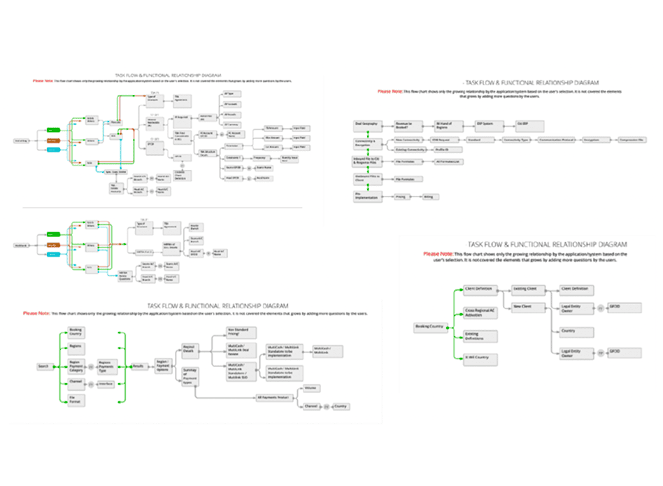
task flow and functional relationships

diagrams tracing how a deal form grows with each selection a user makes, product by product.

outcome: the branching became visible, separating questions that were structural from questions that had simply accumulated.

four task flow and functional relationship diagrams showing how a deal form branches with each selection the user makes

current-state journey

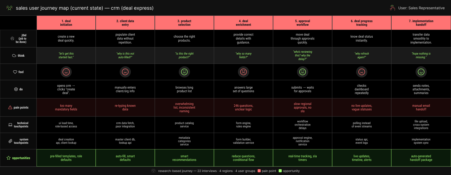
the sales journey from deal initiation to implementation handoff, with what people think, feel and do at each stage, recreated with ai assistance to protect client confidentiality.

outcome: the low points, waiting for approval and reworking, became the opportunities the redesign aimed at.

current-state sales user journey map, recreated with ai assistance to protect client confidentiality

design foundations

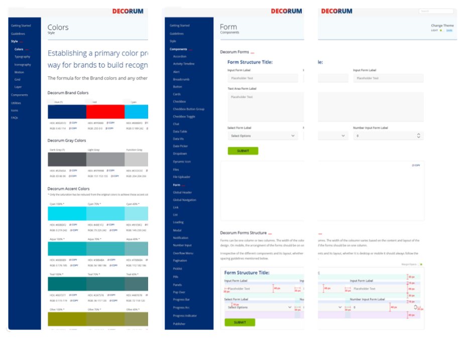
"unified design language across crm modules."

i established the core foundations of the design system (colour, typography, spacing, elevation and interaction tokens) mapped directly to production code. these foundations created a single source of truth across all crm modules, enabling visual consistency, accessibility, and rapid ui assembly.

design system documentation: colour styles, form components and themed form layouts

design-to-code pipeline

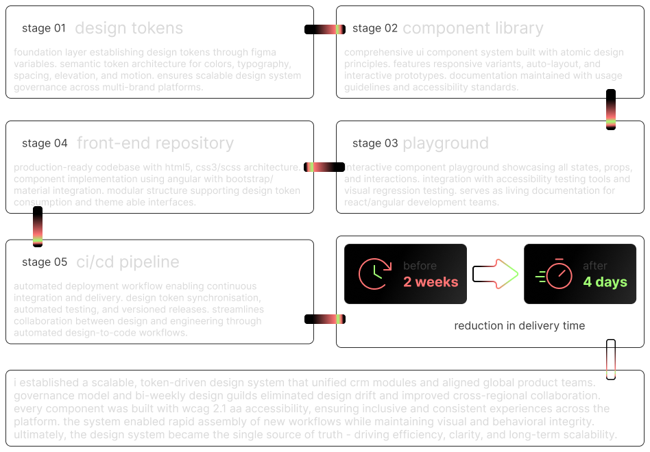
front-end teams cut a new product's build from two weeks to four days using reusable components and templates. a governance model and bi-weekly design guilds kept regions aligned and stopped design drift.

design-to-code pipeline in five stages: design tokens, component library, component playground, front-end repository and ci/cd. the figures are given in the text above.

fragmented eco

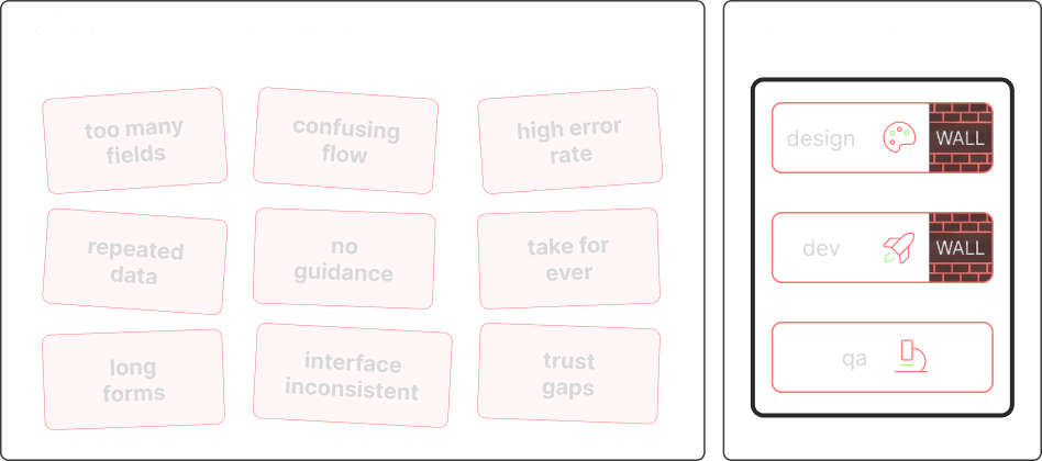
before: a fragmented experience with too many fields, a confusing flow, frequent errors and separate design, development and qa workflows

fragmented eco

research cadence

constraint

product owners in five time zones decided for users, not with them

what i changed

i ran repeated sessions with the business to argue for meeting users directly, then set up periodic surveys and remote walkthroughs so feedback kept arriving.

outcome

users were in the room

and the re-entry problem surfaced within weeks.

shared decisions

constraint

prefill was not mine to decide alone

what i changed

i ran question consolidation workshops with product owners in every region, and worked with data analysts on historical data-flow trends to establish what could safely be pre-populated.

outcome

246 questions became 168

with 40% of fields filled from what the bank already held.

design system

constraint

engineering was split by region and by vendor, each with its own code practice

what i changed

i defined shared colour, type, spacing and interaction tokens with accessible colour standards, and globalised the layout and interaction patterns.

outcome

one visual language across the crm modules

with accessibility built into the components.

platform delivery

constraint

the front end ran on a vendor platform none of us controlled

what i changed

i learned the vendor's standalone tool and spent three months integrating the design system into its core css library rather than styling screen by screen.

outcome

a new product's front end dropped

from two weeks to four days.

solution & approach

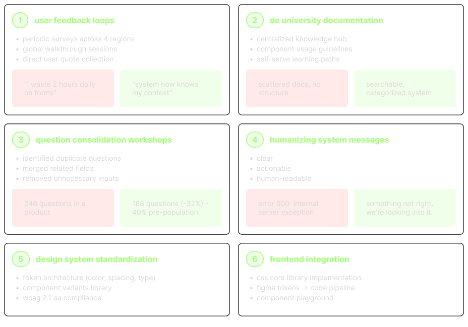
response at system level: user feedback loops, documentation, question consolidation, plain-language messages, design-system standards and front-end integration

how i validated

two questions guided the testing:

impact & kpi

  • 246 → 168questions per product, 32% fewerproduct audit
  • 40%of fields prefilled from client and deal dataproduct audit
  • 47% fewersupport ticketsservice-desk report, q4 2022
  • 56% fewerusability issues8 usability sessions
  • 68% fewerdata-entry errors8 usability sessions
  • two weeks → four daysfront-end build per new productdelivery records

measured in q4 2022 against the pre-redesign baseline.

reflection

what i'd keep, and what i'd change

proxies aren't users.

  • product owners spoke for sales teams for years.
  • once users were in the sessions, the real problem, re-entering data the system already held, was obvious within weeks.
  • next time i'd bring users in from week one.

alignment is design work.

  • getting five time zones of product owners to agree on one question set took as much effort as the interface did.
  • the guilds and the decision log mattered as much as any screen.
a global crm is an ecosystem, not a screen.
scroll to explore